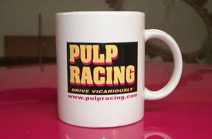
The correct logo on a mug on December 22nd. Only $12, including tax and shipping!
December 31, 1999
Building the Pulp Racing Brand
Name
"Logo Misery"

The correct logo on a mug on December 22nd. Only $12, including tax and
shipping!
Now that I have this company called Pulp Racing, I feel that it is important to properly build the brand recognition. (not sure what it would be recognized for, but at least I want to have a consistent look) Much like Microsoft, Yahoo, Intel, Motorola, etc, brand their products with the same logo and tag line ("Where Do You Want to Go Today", "Intel Inside", "Do You Yahoo?") that remains the same. However, I seem to be having some problems in getting the consistent logo. Let me explain the debacle....
Back in August of 1998, I wanted to have some shirts made up for the LA Street Race, so we would look like an actual race team, instead of the usual Beavis and Butthead image we normally have at the race track. At the last minute, I had to rush order some shirts, but I did not have time to get it properly done, etc, as it was a rush order in order to get the shirts ready for the race. The shirt company wanted me to order a zillion shirts, but I just wanted some for the pit crew and me and Wayne, and to give some out to friends hanging out at the LA Street Race. So the shirts came out with my logo looking like this:
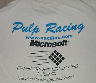
First iteration of the Pulp Racing logo on the back of a t-shirt
The logo could have been improved, and the shirt is busy, with four "brand names" on there. (Note, this back when I used to work for the company that is still being unfairly prosecuted for giving consumers a free browser)
Right before we left for the Virginia City Hill Climb in June 1999, we had another rush order for decals for the truck and the trailer. Since the trailer came in late, we got both of them decaled at the very last possible minute. The stickers looked awesome on the white trailer and truck.
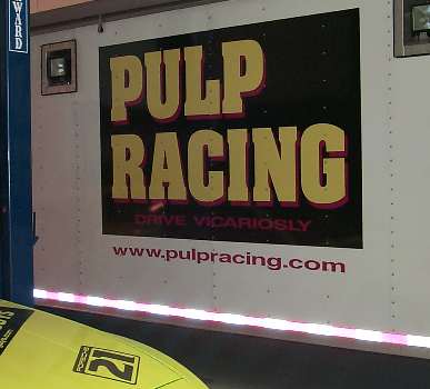
Huge six foot logo on the side of the trailer
Remember I said we were in a rush? After we picked up the vehicles, we discovered that the "Drive Vicariosly" didn't show up good on the black, and, worse yet, the decal folks spelled "Vicariously" wrong, as they left out the "u" in "Vicariously". Yes, we have it spelled wrong on the other side of the trailer also. And on the back of the trailer door is another six foot logo the size of the entire rear door that is spelled incorrectly. So much for looking cool......especially when the decals on the door of the truck have it spelled wrong also......
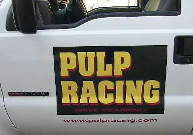
The door of the truck, with the word "Vicariously" also spelled wrong.
After things calmed down a month, I took the time to get a better looking T-shirt made. This shirt company wanted me to get a bunch made, but now I am of the opinion that I go for a small order for the first time, until I am convinced it is the look that I want for the company. The 2nd batch of shirts came out looking like this:
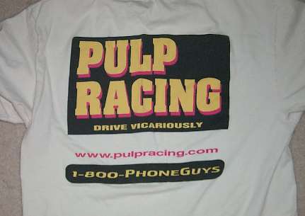
The second iteration of the rear view of the t-shirt.
This shirt also looks too busy. The 1-800-Phoneguys logo doesn't blend in with the shirt, and the www.pulpracing.com is about three inches too low, as it should be right underneath the big logo. Fortunately, I only got a few of them made, as this didn't look all that great.
Back to the drawing board. Around August 1999, I went to get more t-shirts made, and again it was another Rush order (which means pour extra dollars to hop in front of someone else's t-shirt jobs), and another minimum sized order. Now it came out looking like this:
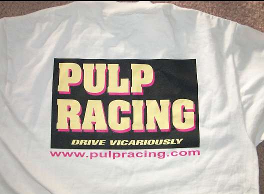
Rear view of latest t-shirt
Okay, now we got it on the money! From now on, all logos will look like this! It is the new company standard. Now the goal is to get more brand recognition than Microsoft, Intel, and Yahoo. I ordered another 100 T-shirts to start selling on the web. I advertise it on www.pulpracing.com (aka www.nsxfiles.com) under "Pulp Gear".. Michael Kwon buys 25 to take to Korea, and plans to use them as giveaway items to get Korean kids started in road racing. His motive? He sells go-fast parts in Korea, and the faster the kids want to go, the more go-fast parts they need from him. He also plans to translate some of The NSX-Files into Korean on his website.
So now things are looking good. Except that apparently Wayne didn't get the word about the new "official" company logo. He got his Ford Explorer decaled with 1-800-Phoneguys and Pulp Racing stickers, except he totally butchers the logo on the hood. (or more correctly, the decal guys butcher the logo)
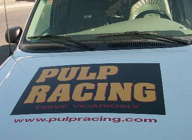
The hood of the Explorer. With "Vicariously" spelled wrong
again.
But they don't stop there. They also get the decal wrong on the passenger side rear quarter
.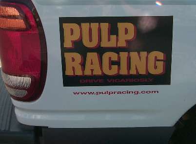
The rear quarter has the wrong spelling also.
I am now starting to scream in frustration about the importance of having a recognizable logo with the proper colors, and trying to build a brand name. I then run around to the other side of the truck, and look at the driver's side rear quarter panel. Is is butchered the worst of all the logos. It looks like this:
.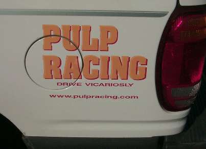
Spelled wrong, AND also doesn't have the black ground.
Do you see Intel, Yahoo, or Microsoft changing the look of their logo constantly, the logo colors, or spelling their taglines wrong? No, they are consistent. So now I feel I have vented my frustrations, and everyone understands what I want.
I call the t-shirt company that printed the 100 Pulp Racing shirts correctly. I tell them I want minimum order of coffee mugs to be delivered by December 1, 1999, so I can start selling them on my webpage and at track events. They tell me the minimum order is 144. I ask if they can make just one of them, so I can verify they haven't screwed up my logo. They tell me, "Don't worry, we will fax you the design we have on file, and we will write in the colors so you can verify the color of the lettering". They fax it to me, I approve it. After all, they did the last batch of shirts correctly, how could it be botched up? So the mugs come to me around December 8th (late, as usual), and they look like this:
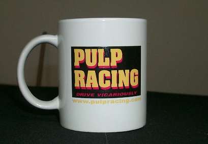
The mug has lettering colors wrong for the taglines! AHHGGGG!
I call the t-shirt company, and I scream at them asking how they could screw up the logo. "Drive Vicariously" should be in yellow, and www.pulpracing.com should be in red, like it was on the faxed directions. The www.pulpracing.com doesn't show up good in yellow letters on a white background, it almost disappears on it, and the goal is to get people to visit my website!. The art guy apologizes, and says he will take 20% off the price of the mugs. 20%? I tell him I DO NOT want 144 copies of the incorrect logo distributed worldwide with the wrong colors, I want to get the mugs crushed, and the correct mugs shipped to me. He agrees, but he says he can't deliver them until December 22, due to the Christmas backlog and the lateness of my order. I tell him that if that is the best he can do, I can deal with it, but so much for advertising them and selling them on the website for people to buy as Christmas presents.. This logo thing is starting to make me fricking crazy.
December 16, 1999. I have a meeting with a guy who says he is looking to distribute decals to various automotive chain stores, and he is looking for an "Asian" type of sticker to appeal to the people who modify their Hondas and other Japanese cars. He heard about me through Mike Duncan. I explain to him that while it is true that I am Asian, and I drive a Japanese car, but my company name is distinctively not Asian. He thinks for a minute, and says he wants his art guy to look at my decal and possibly give it an "Asian" look to it. I start thinking that I don't want my logo butchered again, but then he talks about potential royalties to if he can swing the deal. I immediately tell him to go ahead and modify the logo, and we will talk later. It's a longshot, but if you bet one enough longshots, hopefully one of them will come in.
December 17, 1999, 4:30 a.m. I am the first one at the shop, as we are trailering to Laguna Seca for the TCC Race. Wayne got his car back from the paint shop and the sticker shop late last night. I open the trailer, and I notice that he put a big "Pulp Racing" sticker on the top of his car. Cool. Then, I look closer, and realize that he just used a black background, with the yellow paint showing the letters. The problem is that my official logo has a red shadow around "Pulp Racing", and www.pulpracing.com should be in red. I have a three color logo, and Wayne turns it into a two color logo. ARRRRGGGGHHHH! I am about to shoot myself, to put myself out of "logo misery".......
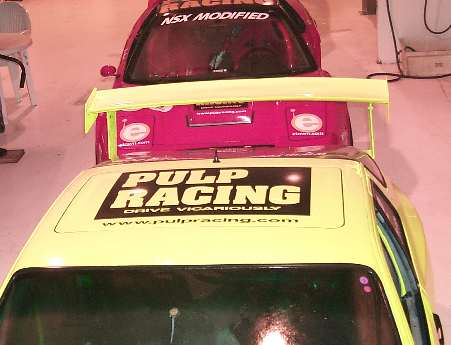
Wayne with the wrong color scheme on my car. At least it is spelled
correctly.